 |
 |
Photograph of front of house |
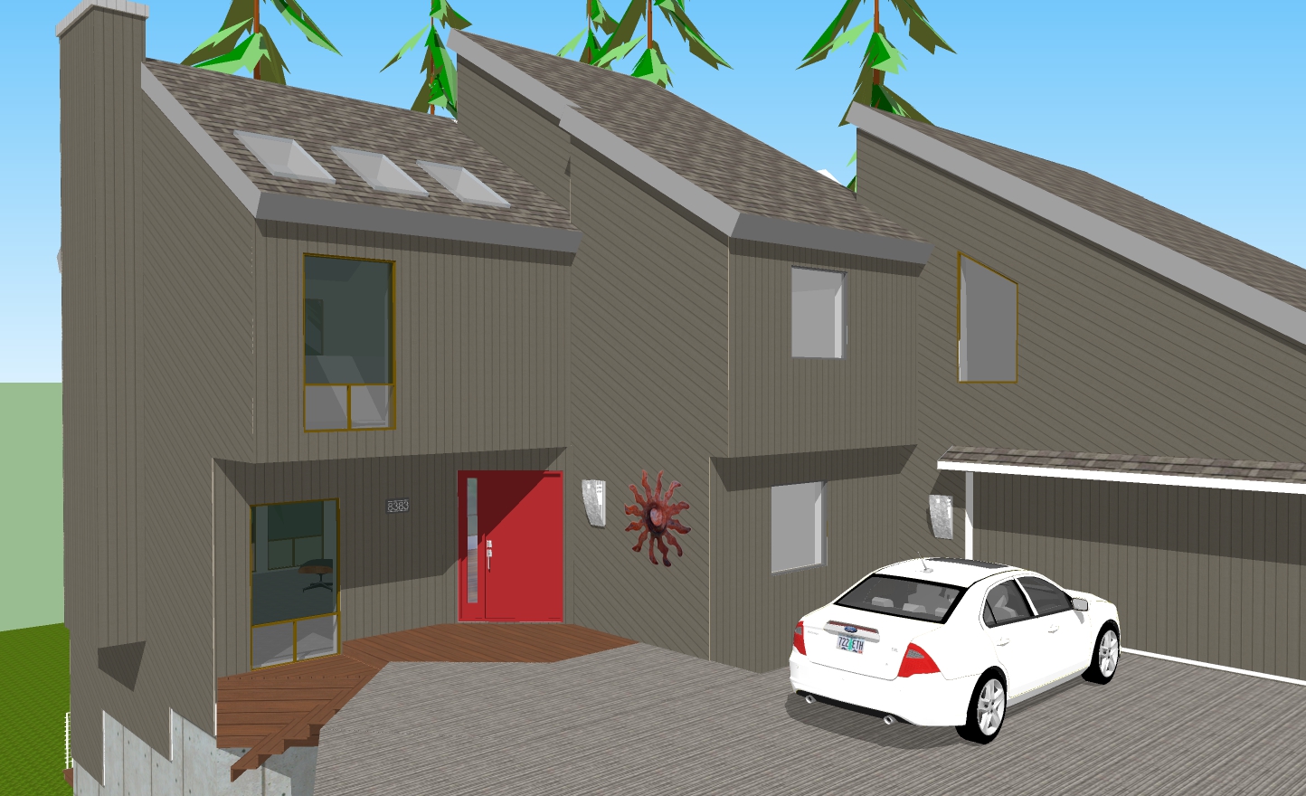
SketchUp model of house |
So we have to repaint the outside of our house. It is currently a somewhat dull light grey but more importantly, it needs new paint. But before we do that, the siding needs to be repaired or possibly replaced, a much more complicated and expensive task since the house has 5,044 square feet of exterior surface over 44 separate facets. But we are discovering an even more challenging task—picking a new color. The house will be a single color as it is now since the architectural style, seventies Pacific Northwest, doesn’t have window trim or the structure for two-tone or accents. We are also replacing the front door (dry rot at the bottom) so this is the only place where we can add a color statement.
The good news is that Karen and I seem to be aligning on the color direction. Early candidates were in the brown, beige, olive flavor. Now we are settling in to taupe. Why be different than 80% of the houses out there! But what hue or lightness? As we look at houses, some seem too light, some too dark, some too brown, some too grey, some too green even though you could call all of them “taupe”. Of course color perception is dependent on the lighting, nearby colors, and other factors. When we do see a house we like, just try to remember that shade when you go to a paint store and try to pick that color from the swatch samples from the rack of hundreds of color chips that all look like “taupe”. It is even difficult to pick a matching color chip on the rack when you are holding a sample color. And we have heard so many times of homeowners carefully choosing a color from a color chart but then after the house is painted being unhappy and thinking the actual color is much darker/lighter/browner/greener/bluer/greyer than they thought it would be. So we are spending time to make the choice. We have looked at many houses and matched good candidates to a color swatch. I have built a 3D model of our house in the CAD program SketchUp so I can simulate colors. This program also lets me add sunlight and shadows to render a more realistic image.
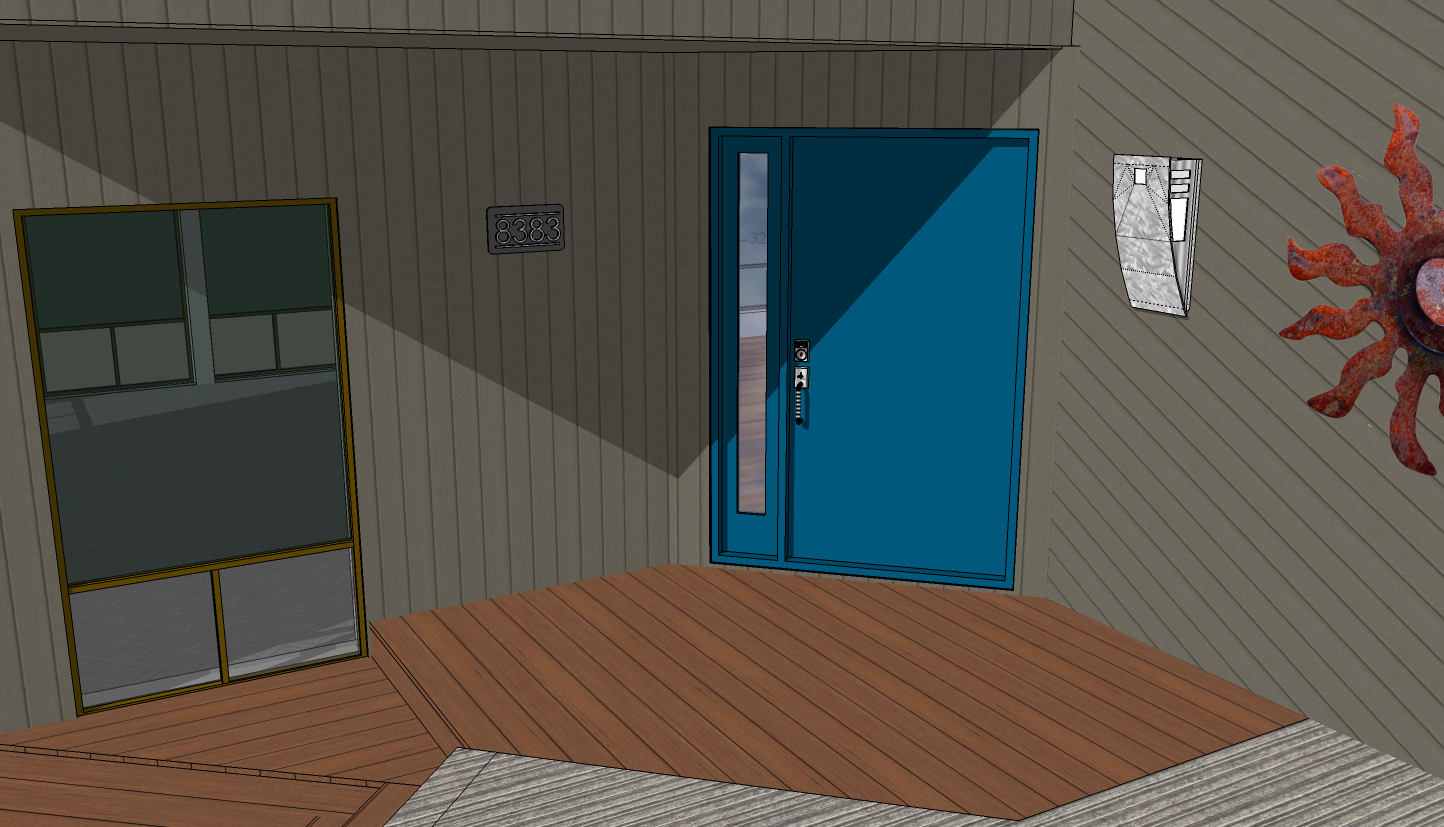
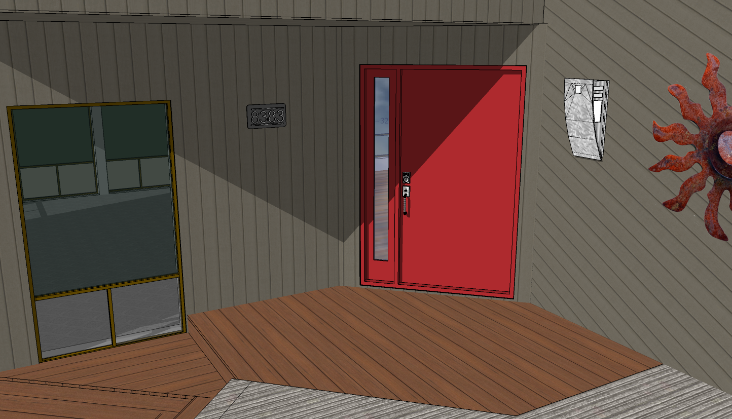
To get an even more realistic appraisal, we are painting the current door and the front of the house around the door with candidate colors so we can see what it might look like in a real-world setting. We have two door styles, two door color candidates, and now at least three flavors of taupe for the siding. Take a look at our mockups and let us know what you think. We currently have all the choices in the CAD model renderings so far the blue and red door and the first taupe siding physical sample.
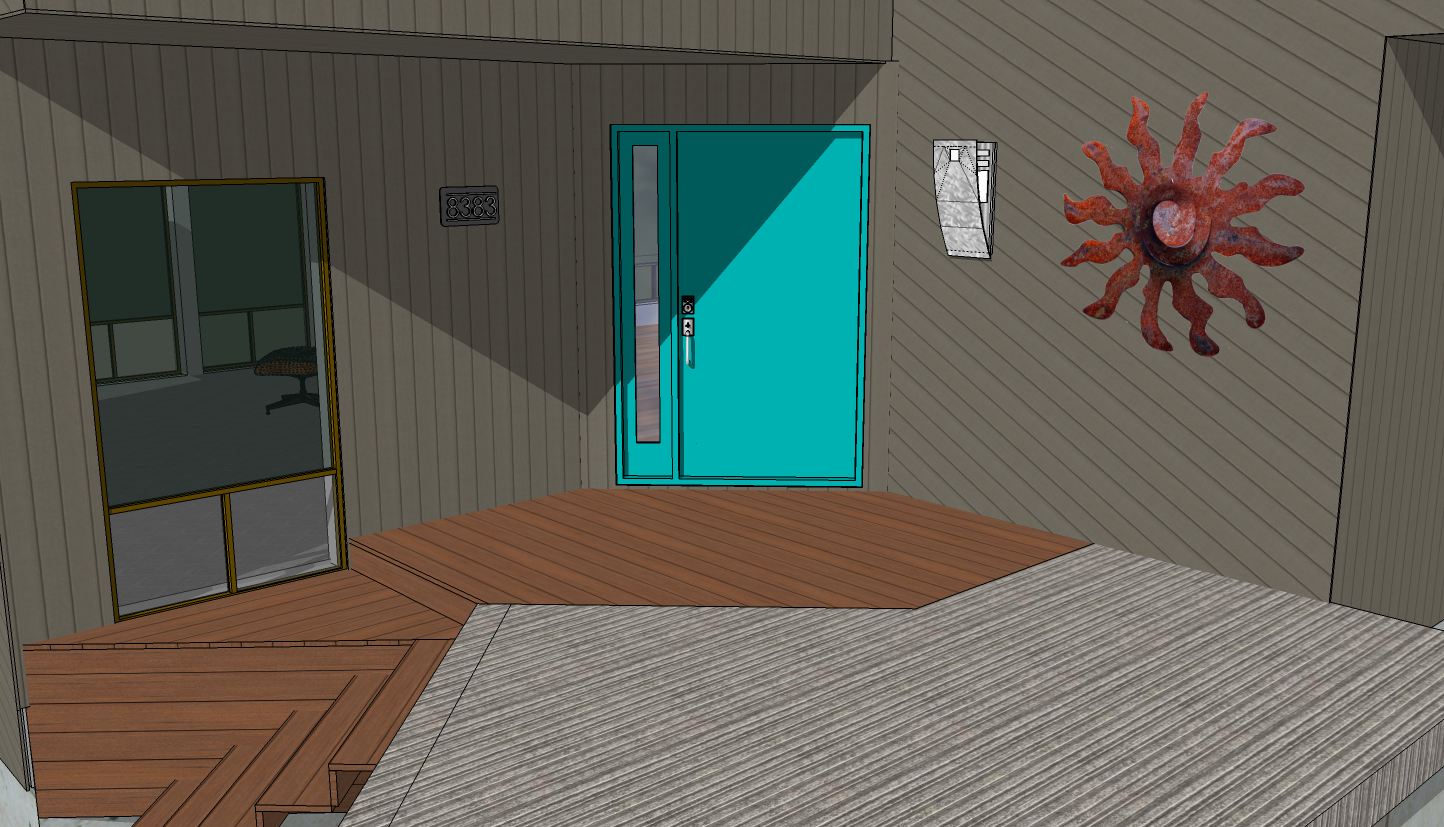
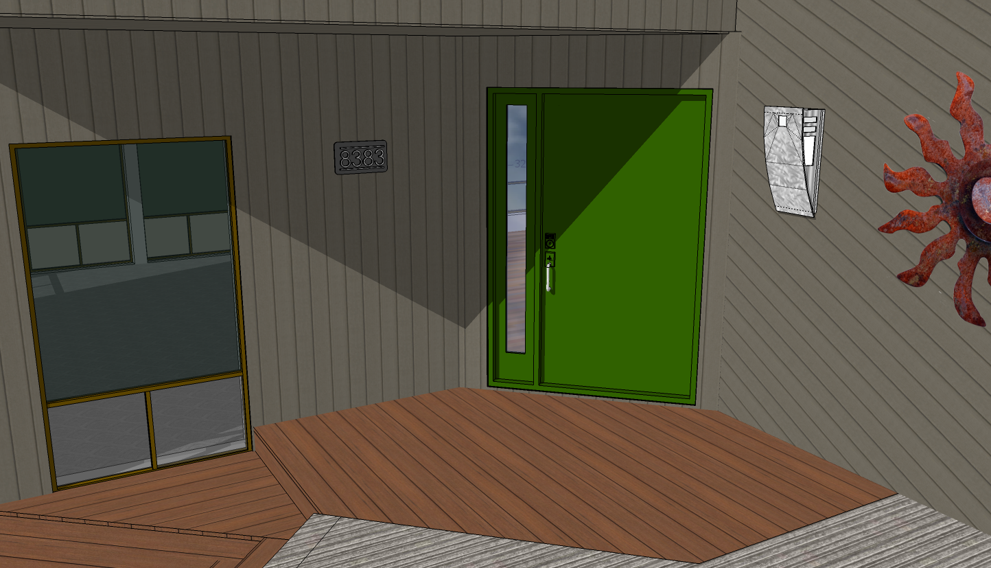
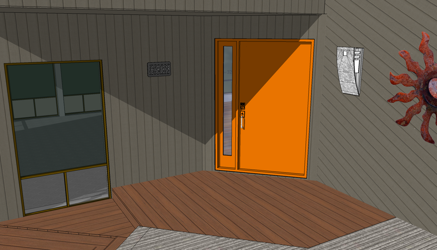
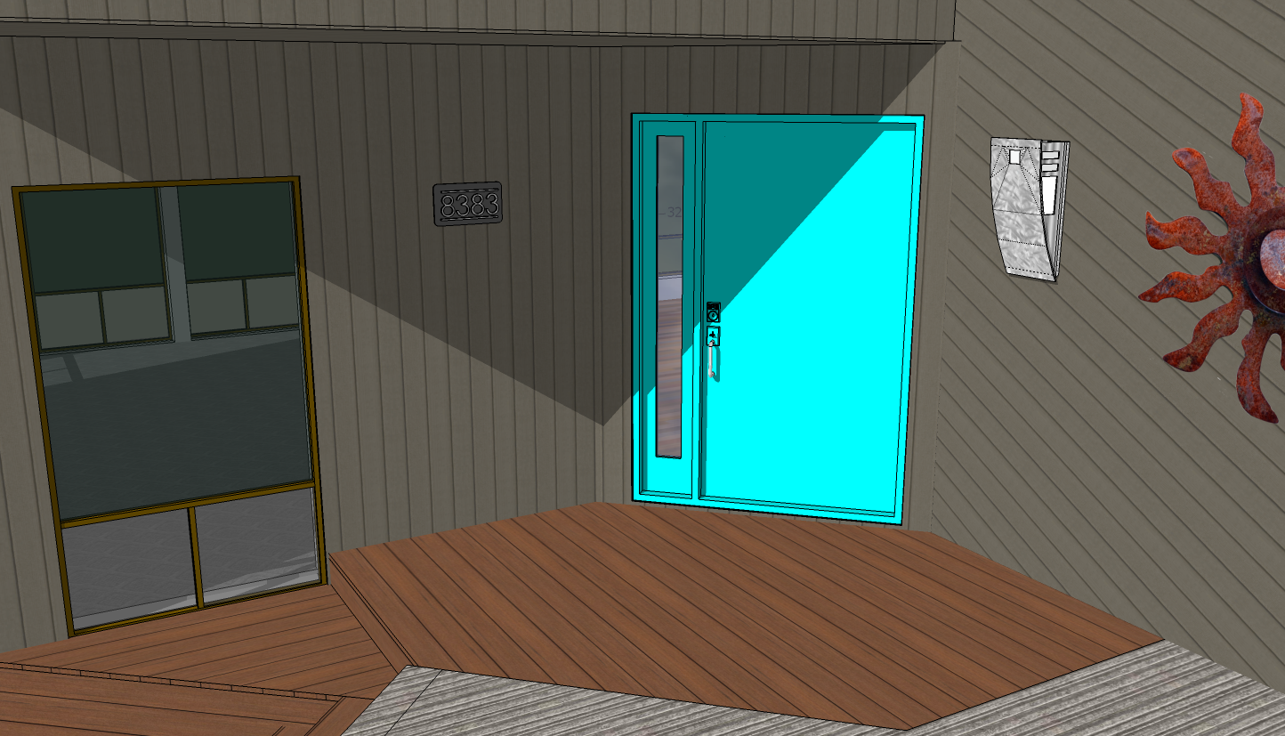
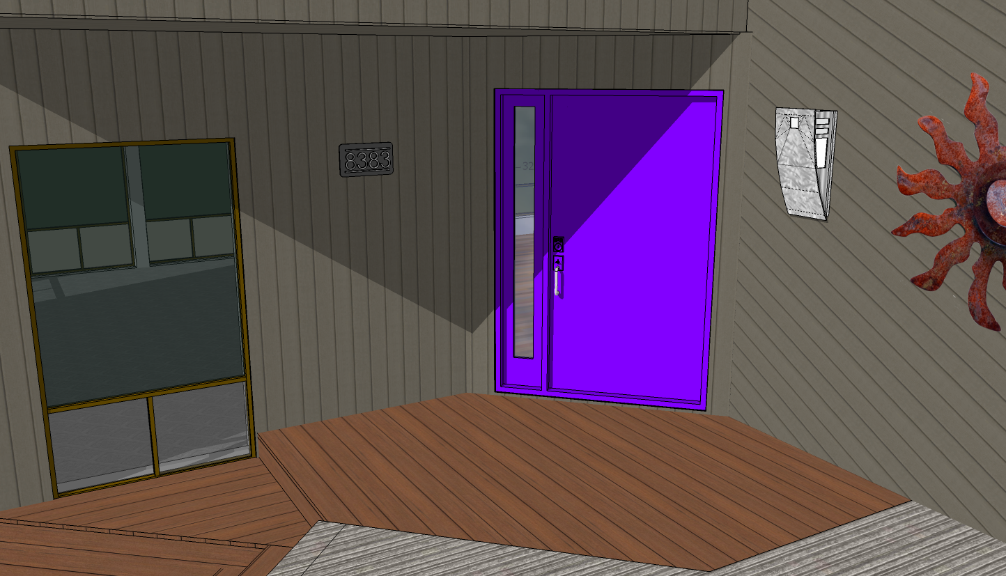
We have had lots of feedback since our initial posting; thanks everyone for your feedback and suggestions, good input. I have now added several more pictures including renderings with all of the door colors suggested. These definitely made us think more about the door color. I have rendered the door color samples in my CAD model with the sun and shadows turned on for mid-day to try to show how this lighting affects the color tone. And of course, I may not have chosen the orange/turquoise/purple/teal/green shade you had in mind.
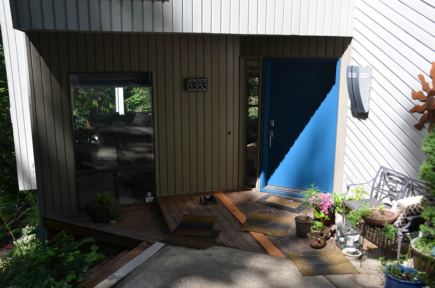
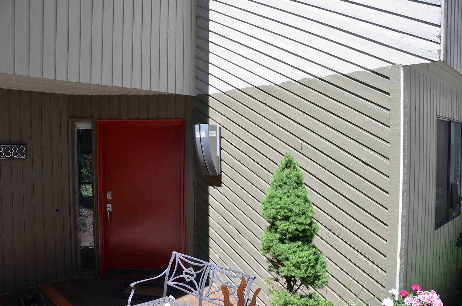
I have also now painted the siding around the door with the taupe we had settled on so I have pictures of the blue door with this taupe sample and now also the red door against the taupe. After painting the taupe, it seemed much lighter than I had thought, imagine that. In some lighting, it doesn’t look that much darker or different than the current blah grey and does seem lighter than the taupe I mixed for my CAD model, despite an effort to match the color switch I had. Karen likes this first taupe sample just fine, I’m not yet sure.
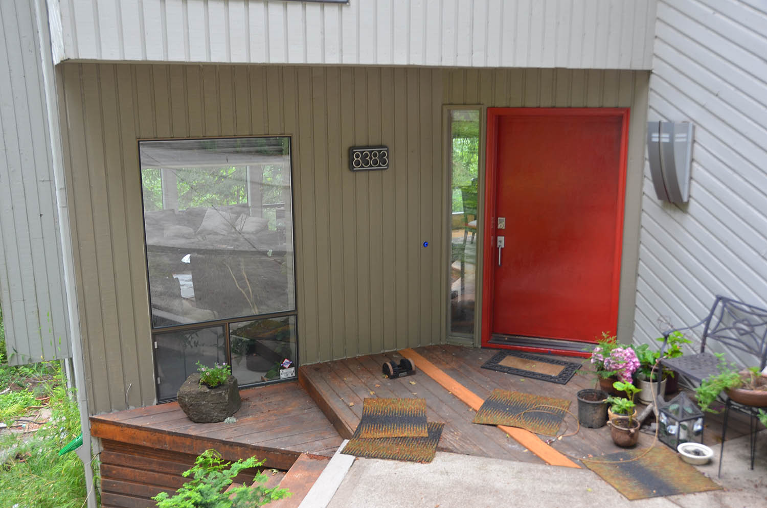
While this color test exercise is interesting, it is showing how important it is to do this. We have been surprised at every result. Karen was sure she wanted the red until I painted the door that exact color. Some of the suggested colors that we may not have initially selected to test are starting to look interesting. Good thing that we have the time to mess around with this and over-think it.
 |
 |
 |
 |
 |
Current black door with grey siding |
Medium blue door with taupe siding |
Red door with taupe siding |
Light blue door with taupe siding |
Lime door with taupe siding (Geoff) |
 |
 |
 |
 |
 |
Green door with Taupe siding (Pat) |
Orange door with taupe siding (Candyce) |
Turquoise door with taupe siding (Marilee) |
Purple door with taupe siding |
Teal door with taupe siding |
 |
 |
 |
 |
Blue door with current grey siding |
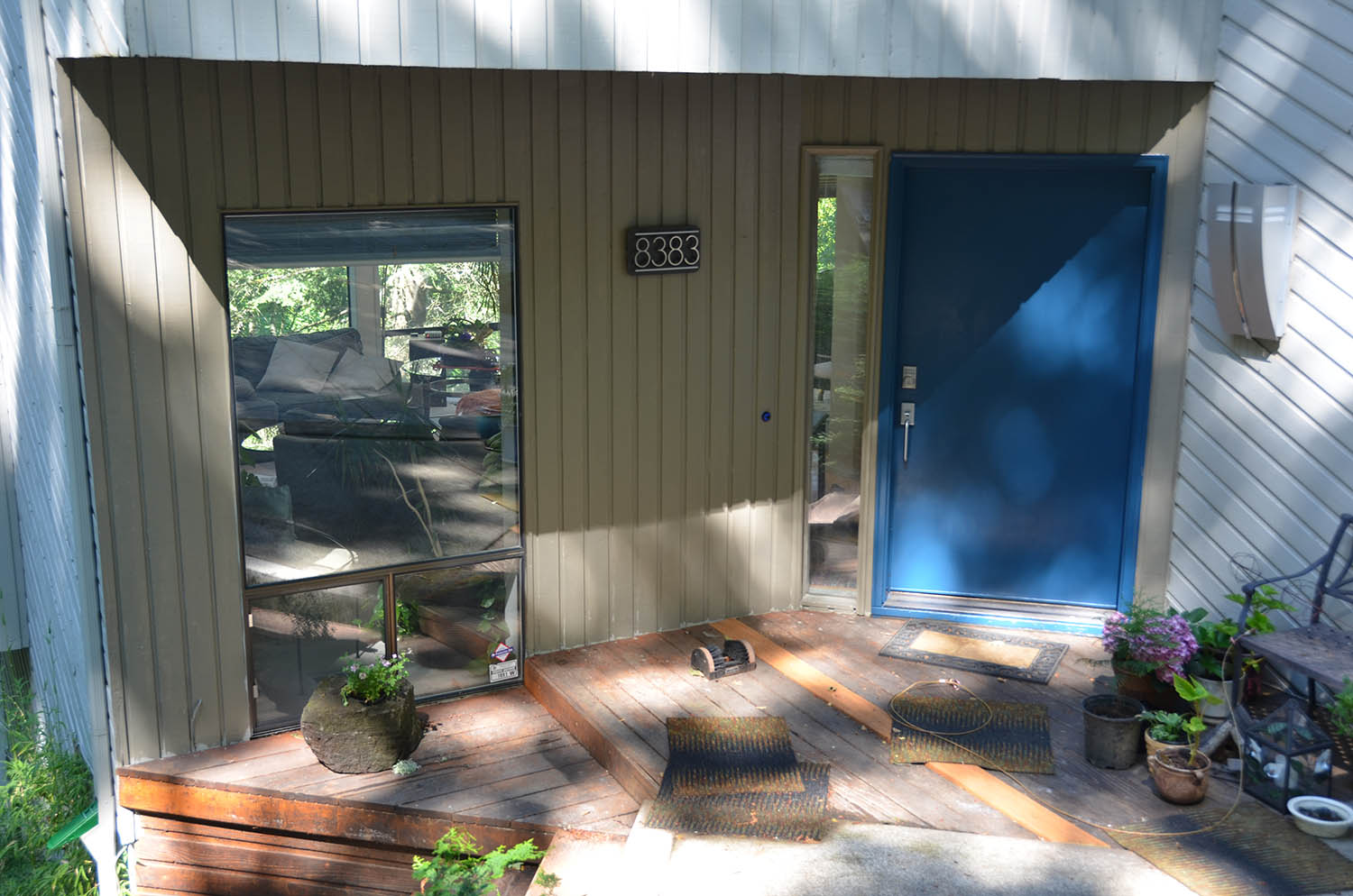
Blue door with partial sun |
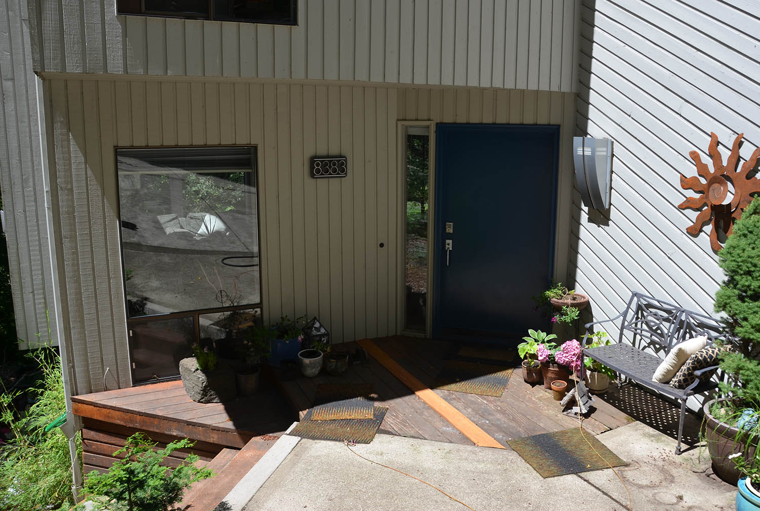
Blue door in the shade, hard to see wall color |
Blue door with first taupe siding |
 |
 |
 |
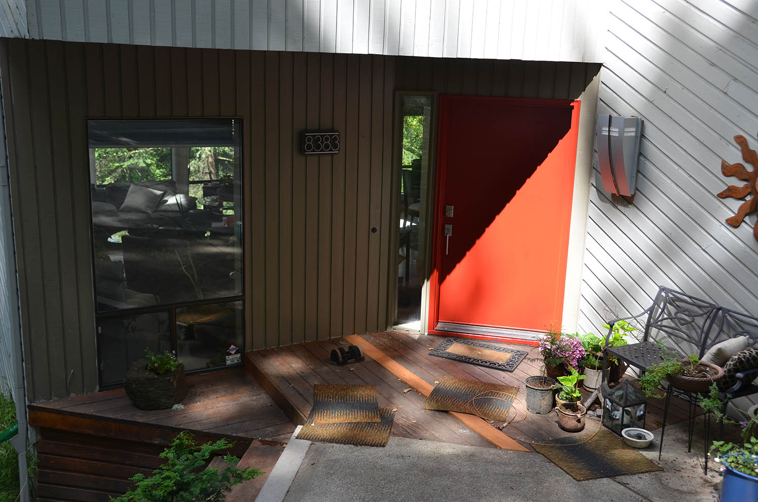 |
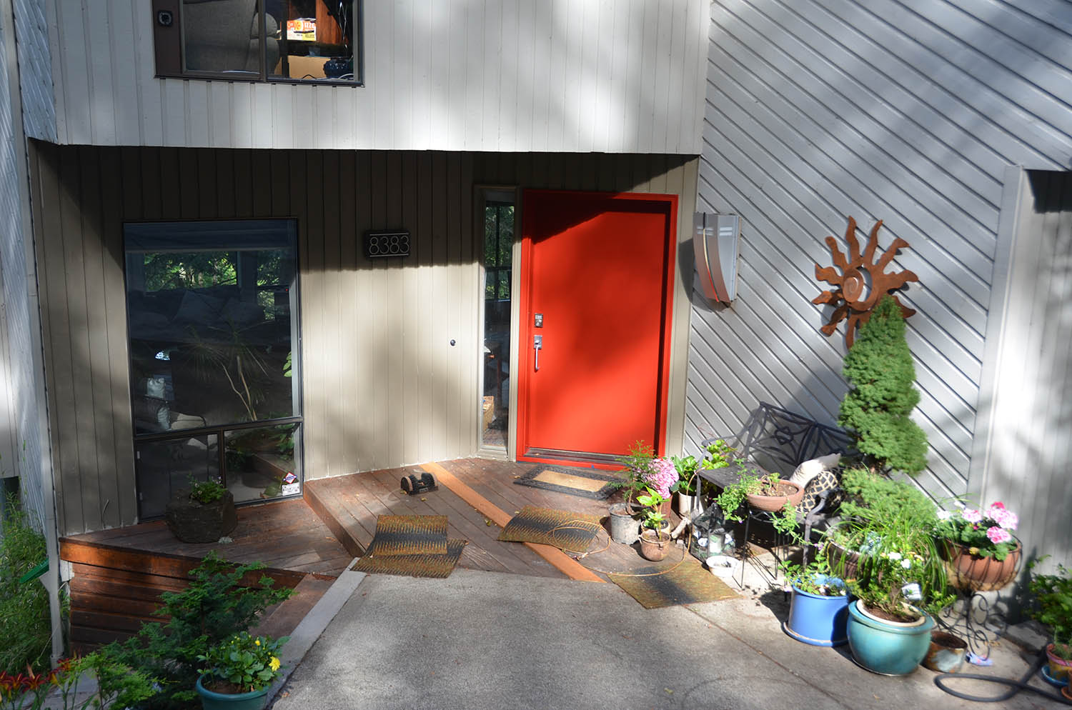
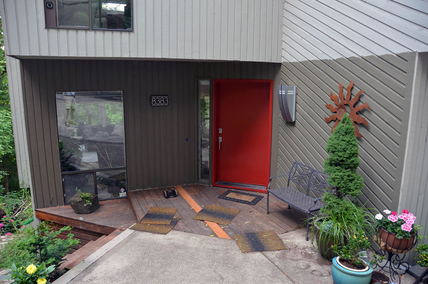
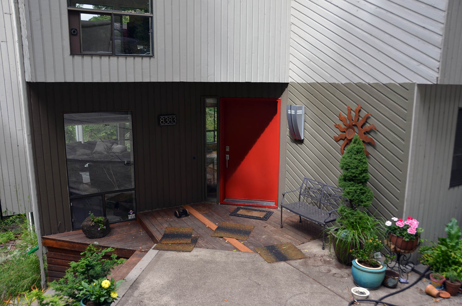
Red door with taupe siding, partial sun |
Red door with taupe siding, little sun |
Red door with taupe siding, strong defused sun |
Red door with taupe siding, strong shadow and sun |
 |
 |
 |
 |
Final test painting: Aged Olive wall to the right of the door. |
Not easy to see the difference between the Monk's Cloth to the left of the door and Aged Olive to the right |
Some defused sun |
Brighter sun but wall to the left in the shade |
Mocha Accent |
Aged Olive |
Monk's Cloth |
|
This was the first color we chose. |
This was an effort to get a hint of green |
Same lightness level but more brown than green |
|